Advanced R: Day 3
Data visualization with ggplot2
Richard Paquin Morel
(slides created by Kumar Ramanathan)
(slides created by Kumar Ramanathan)
2019-09-18
Example: Scatterplot from Day 1
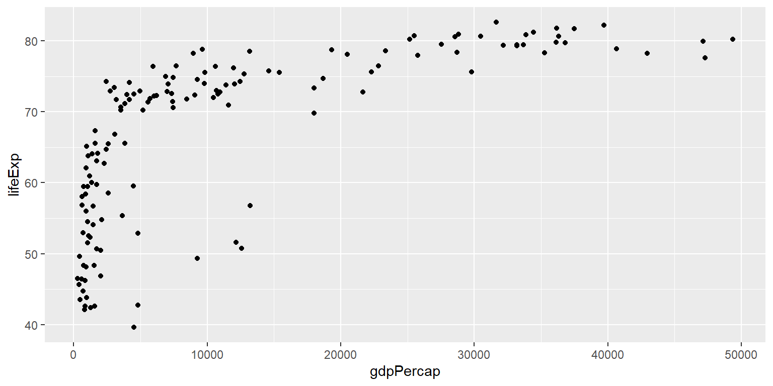
Example: Scatterplot from Day 1
ggplot(gapminder07) +
  geom_point(aes(x = gdpPercap, y = lifeExp)) +
  labs(title = "Relationship between life expectancy and GDP per capita in 2007",
       x = "GDP per capita", y = "Life expectancy")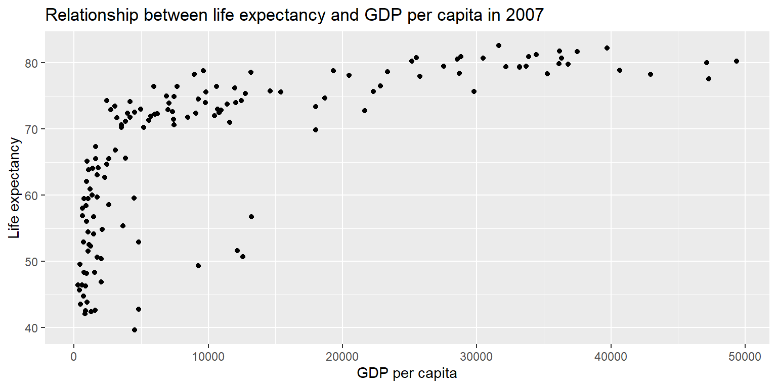
Exercise 1: Scatterplot
ggplot(gapminder07) +
  geom_point(aes(x = log(pop), y = log(gdpPercap))) +
  labs(title = "Relationship between GDP per capita and population in 2007", x = "Logged GDP per capita", y = "Logged life expectancy")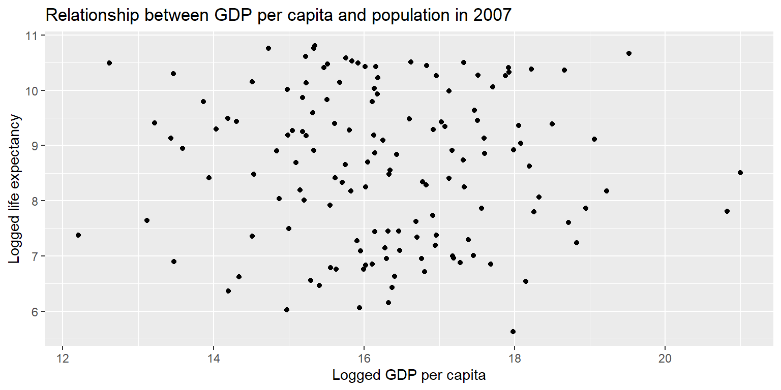
Example: Energy generated over time
long_gen %>%
  group_by(datetime) %>%
  summarise(output=sum(output)) %>%
  ggplot() +
  geom_col(aes(x=datetime, y=output)) +
  labs(title="Total energy generated, by hour", x="Hour", y="Output (MW)")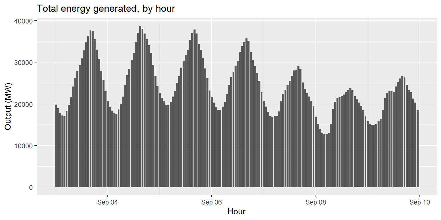
Exercise 2: Hydro power generated over time
long_gen %>%
  filter(source=="large_hydro"|source=="small_hydro") %>%
  group_by(datetime) %>%
  summarise(output=sum(output)) %>%
  ggplot() +
  geom_col(aes(x=datetime, y=output)) +
  labs(title="Total hydro power generated, by hour", x="Hour", y="Output (MW)")
Exercise 2: Hydro power generated over time
generation %>%
  mutate(hydro=large_hydro+small_hydro) %>%
  ggplot() +
  geom_col(aes(x=datetime, y=hydro)) +
  labs(title="Total hydro power generated, by hour", x="Hour", y="Output (MW)")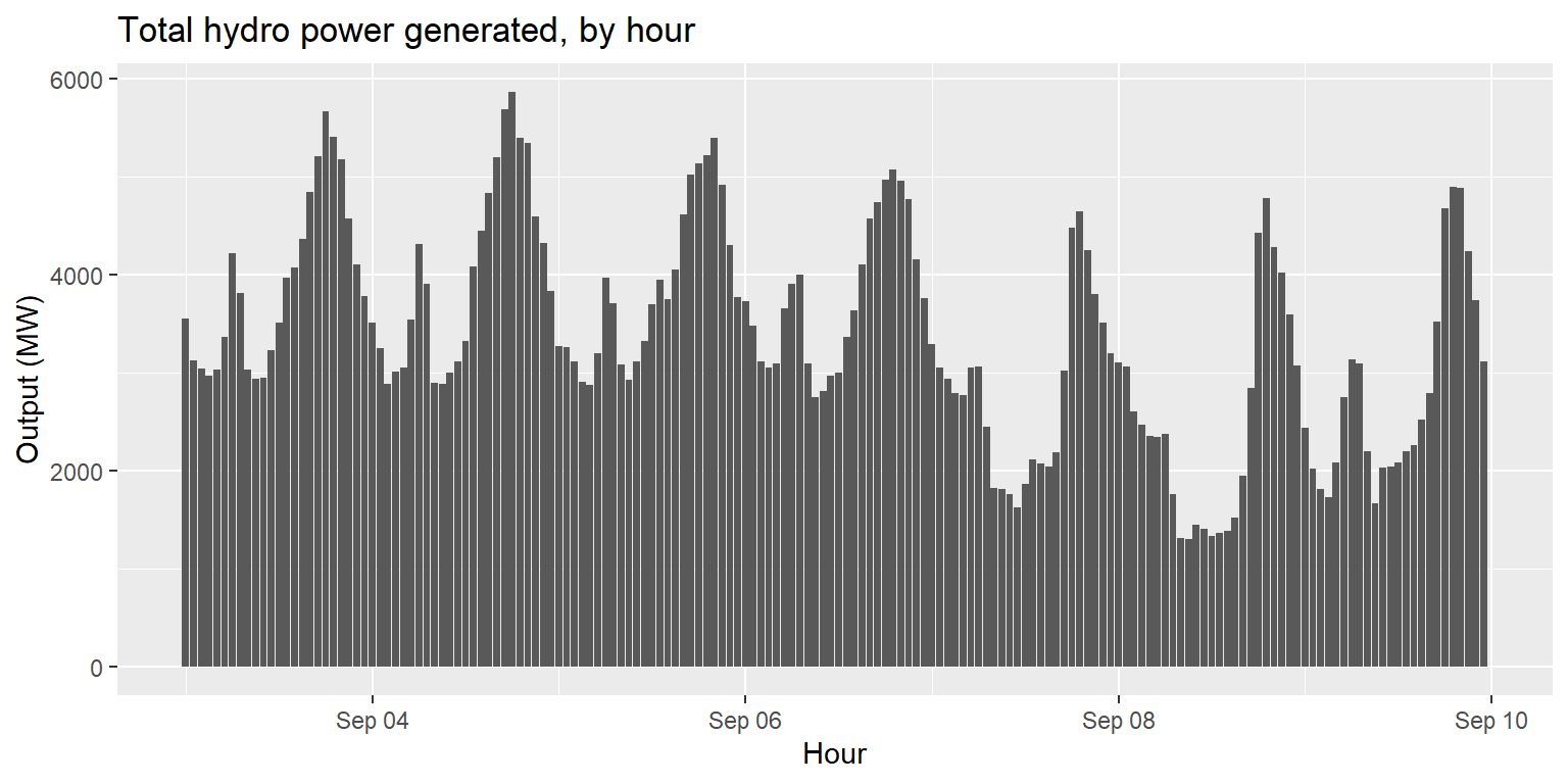
Line plots: geom_line()
imports %>%
  ggplot() +
  geom_line(aes(x=datetime, y=imports)) +
  labs(title="Energy imports over time", x="Hour", y="Amount imported (MW)")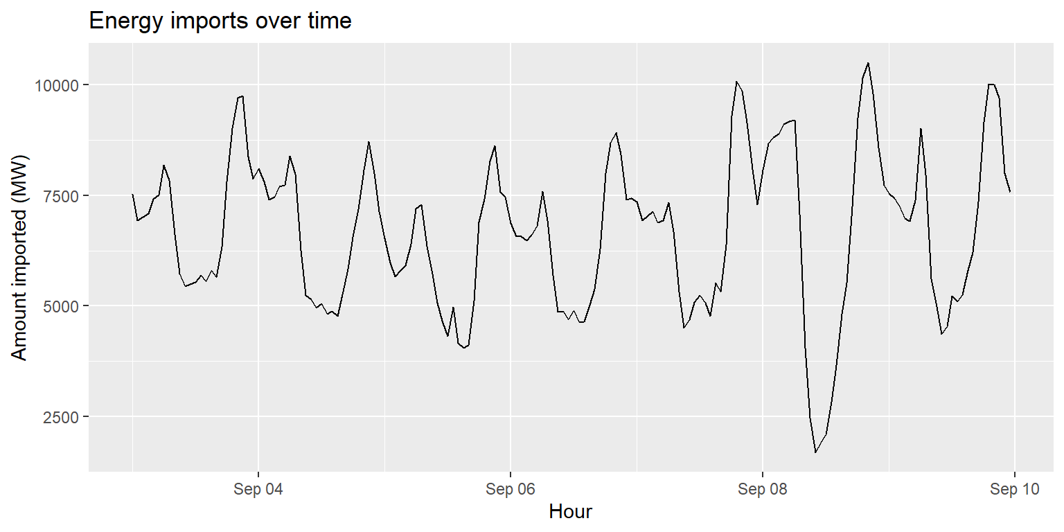
Interlude: changing geom characteristics
imports %>%
  ggplot() +
  geom_line(aes(x=datetime, y=imports), size=1.2, col="red") +
  labs(title="Energy imports over time", x="Hour", y="Amount imported (MW)")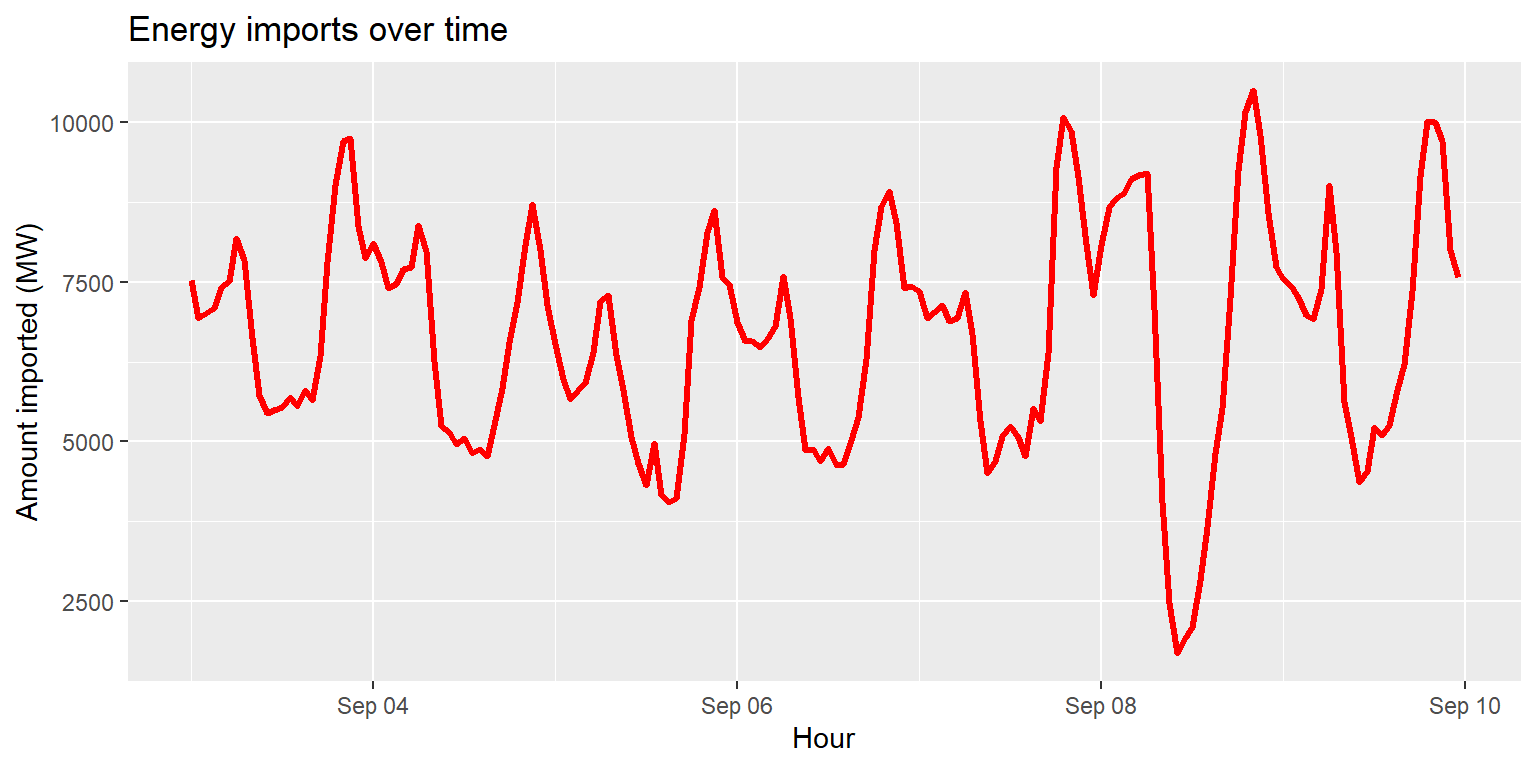
Area plots: geom_area()
generation %>%
  ggplot() +
  geom_area(aes(x=datetime, y=wind), fill="darkblue") +
  labs(title="Hourly wind power generation, Sept 3-9", x="Hour", y="Output (MW)")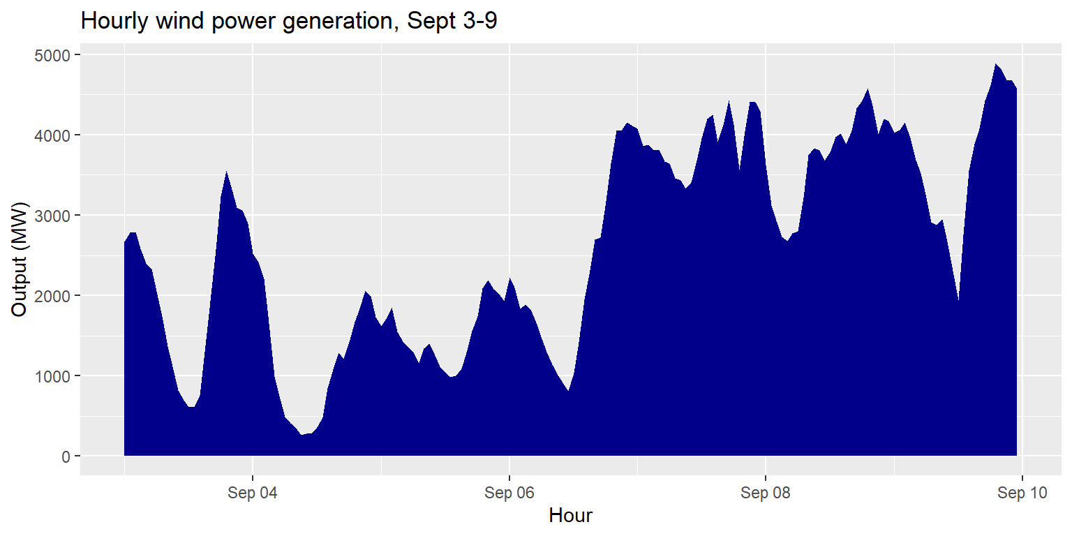
Box plots: geom_boxplot()
long_gen %>%
  ggplot() +
  geom_boxplot(aes(x=source, y=output)) +
  labs(title="Amount of energy generated by each source, Sept 3-9", x="Source type", y="Output (MW)")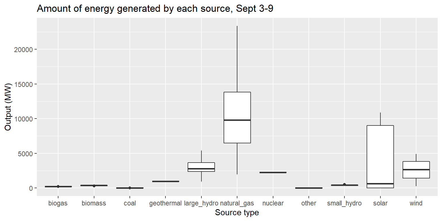
Multiple geoms in one plot
generation %>%
  ggplot() +
  geom_line(aes(x=datetime, y=large_hydro), col="turquoise3") +
  geom_smooth(aes(x=datetime, y=large_hydro)) +
  labs(title="Hydroelectric (large) generation per hour, Sept 3-9", x="Hour", y="Output (MW)")
## `geom_smooth()` using method = 'loess' and formula 'y ~ x'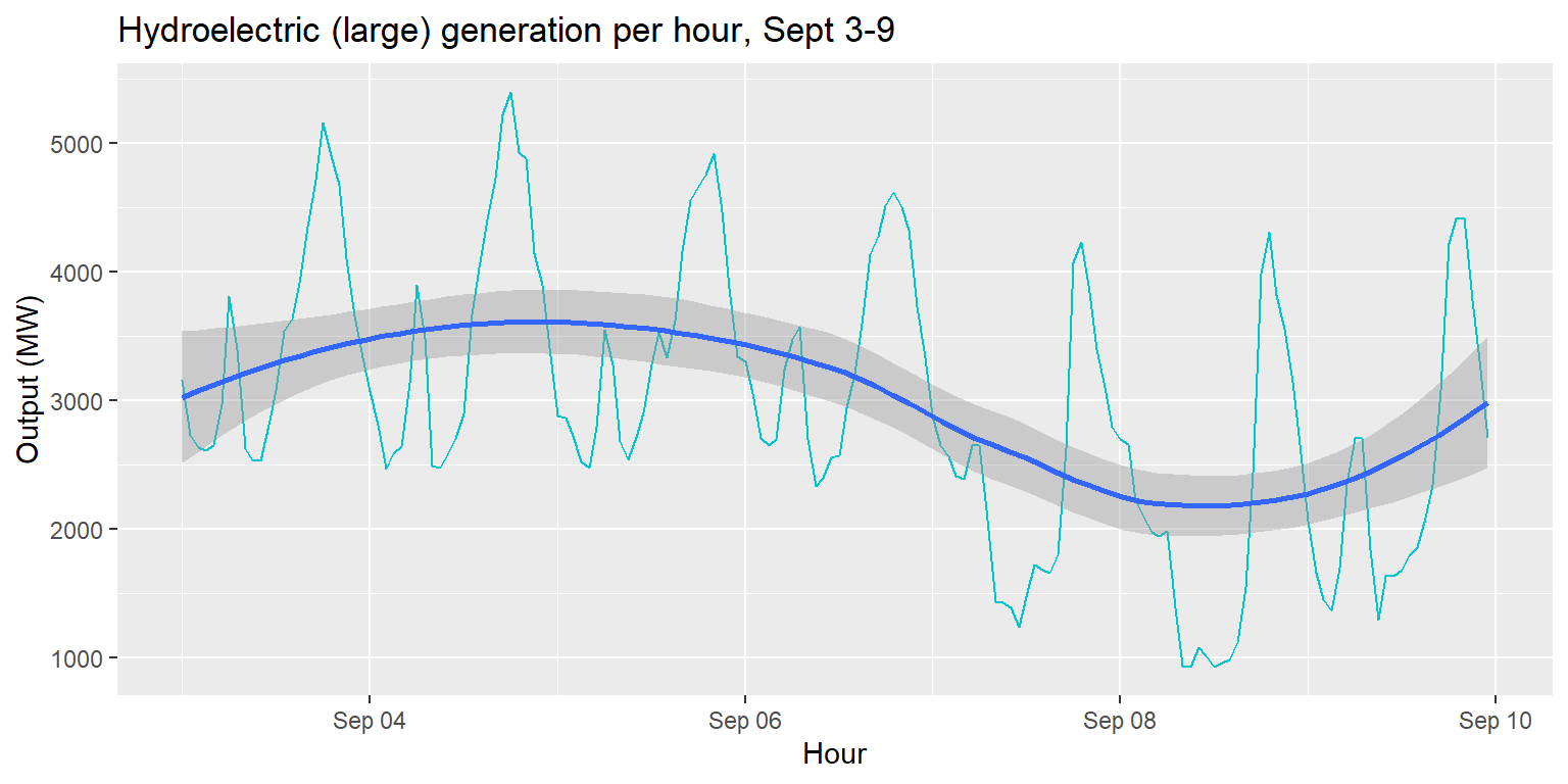
Exercise 3: Total output per source
long_merged_energy %>%
  group_by(source) %>%
  summarise(output=sum(output)) %>%
  ggplot() +
  geom_col(aes(x=source, y=output), fill="darkred") +
  geom_hline(aes(yintercept=mean(output))) +
  labs(title="Total output per energy source over Sept 3-9", y="Output (MW)", x="Source")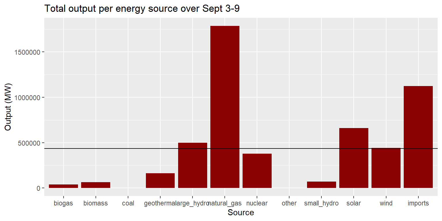
Labels
imports %>%
  ggplot() +
  geom_line(aes(x=datetime, y=imports), col="red") +
  labs(title="Energy imports over time in California", subtitle="Hourly data from September 3-9, 2018",
       caption="Source: California Energy Commission", x="Hour", y="Amount imported (MW)")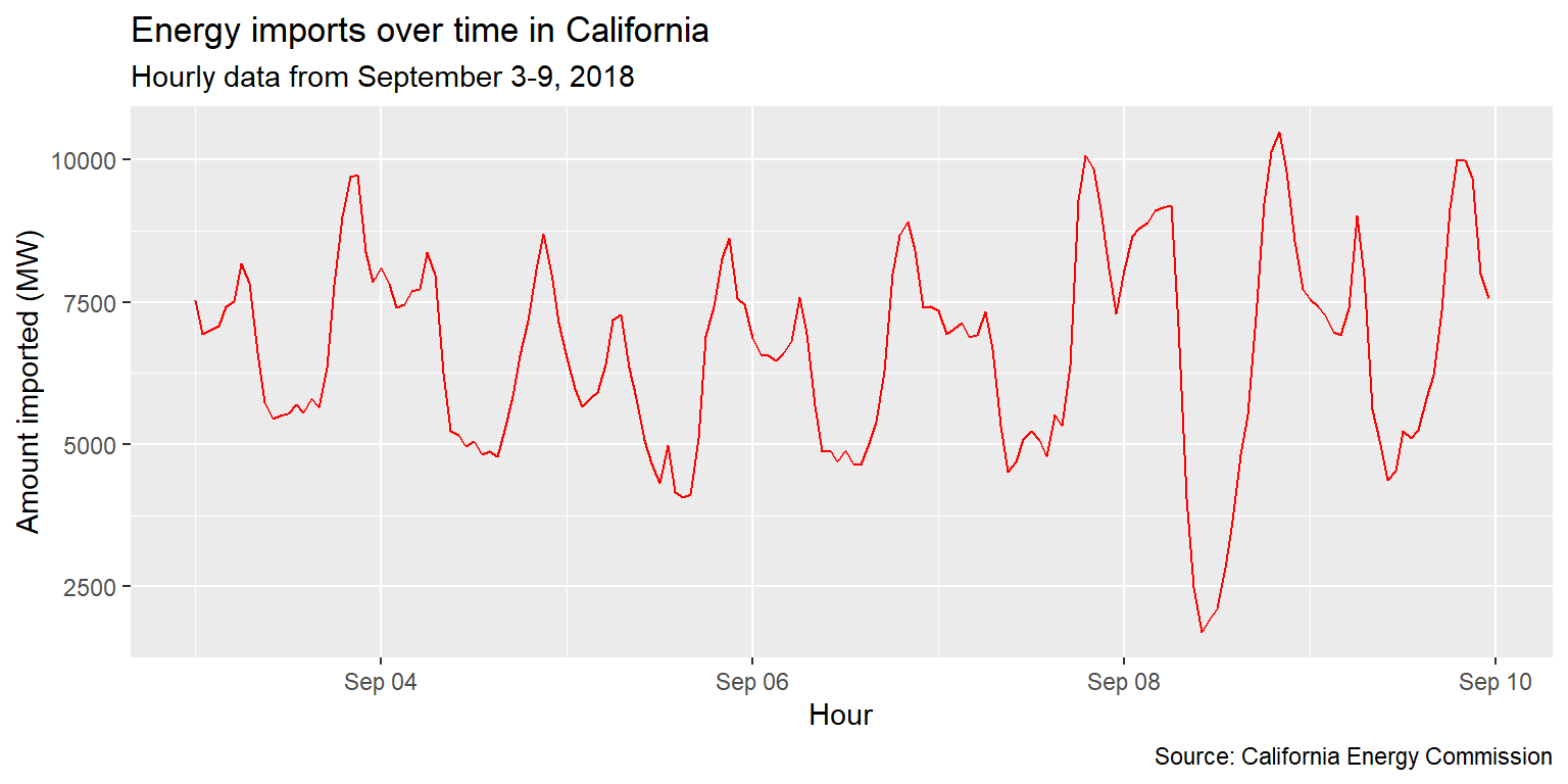
Example: Imports over time
imports %>%
  ggplot() +
  geom_line(aes(x=datetime, y=imports), col="red") +
  scale_x_datetime(date_labels="%H:%M", date_breaks="12 hours") +
  labs(title="Energy imports over time in California", subtitle="Hourly data from September 3-9, 2018", x="Hour", y="Amount imported (MW)")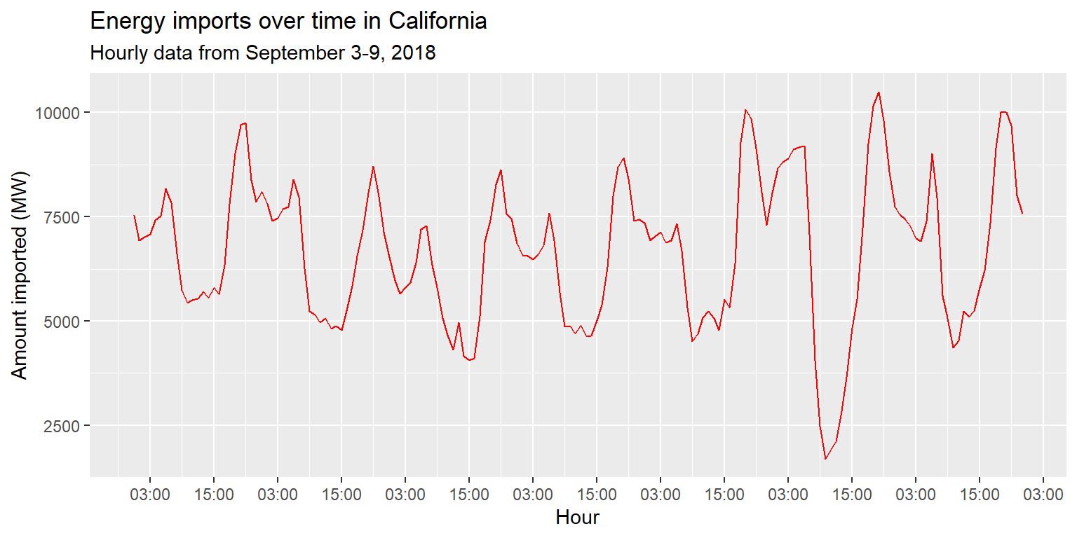
Example: Imports over time
imports %>%
  ggplot() + geom_line(aes(x=datetime, y=imports), col="red") +
  scale_x_datetime(date_labels="%H:%M", date_breaks="12 hours") +
  labs(title="Energy imports over time in California", subtitle="Hourly data from September 3-9, 2018", x="Hour", y="Amount imported (MW)") +
  theme_minimal()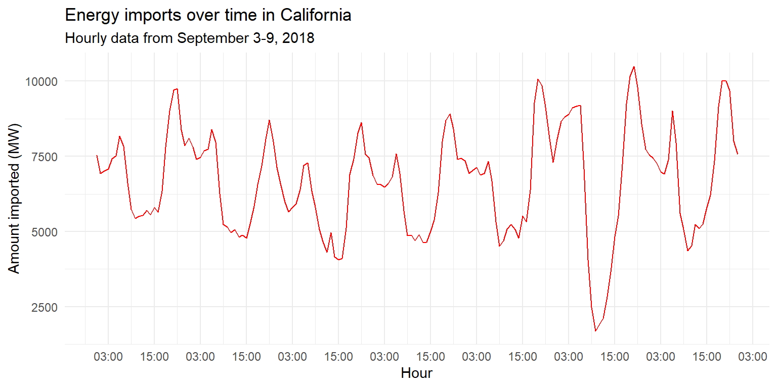
Example: Imports over time
imports %>%
  ggplot() + geom_line(aes(x=datetime, y=imports), col="red") +
  scale_x_datetime(date_labels="%H:%M", date_breaks="12 hours") +
  labs(title="Energy imports over time in California", subtitle="Hourly data from September 3-9, 2018", x="Hour", y="Amount imported (MW)") +
  theme(axis.text.x=element_text(angle=45, hjust=1, size=12))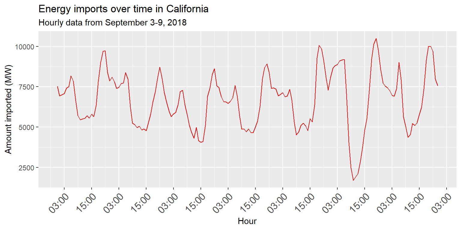
Example: coord_flip()
long_gen %>%
  mutate(date=lubridate::date(datetime)) %>%
  group_by(date) %>% summarise(output=sum(output)) %>%
  ggplot() + geom_col(aes(x=date, y=output)) +
  labs(title="Total energy generated, by day", x="Day", y="Output (MW)")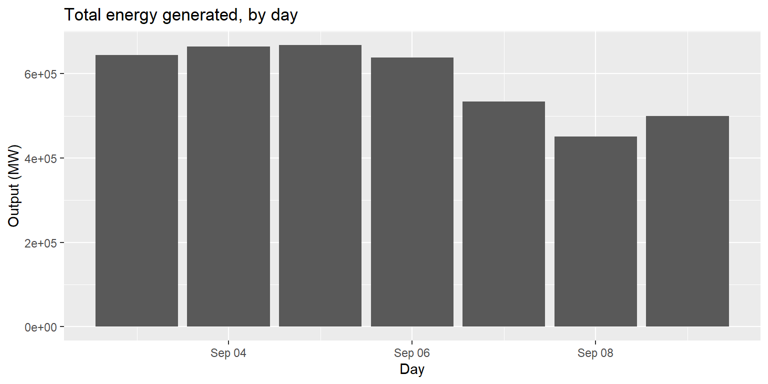
Example: coord_flip()
long_gen %>%
  mutate(date=lubridate::date(datetime)) %>%
  group_by(date) %>% summarise(output=sum(output)) %>%
  ggplot() + geom_col(aes(x=date, y=output)) +
  labs(title="Total energy generated, by day", x="Day", y="Output (MW)") +
  coord_flip()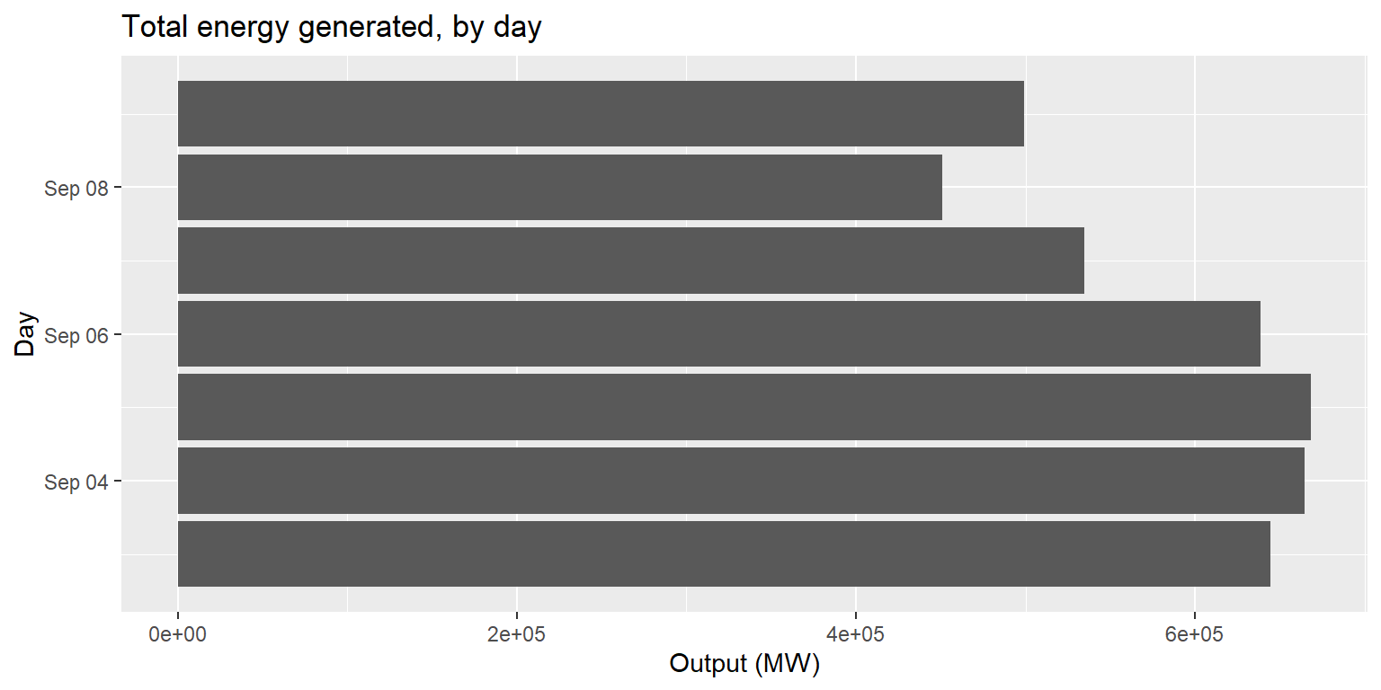
Colors and fill
long_merged_energy %>%
  ggplot() +
  geom_line(aes(x=datetime, y=output, group=source, col=source)) +
  labs(title="Output by energy source over time", subtitle="Hourly data from September 3-9, 2018", x="Hour", y="Output (MW)")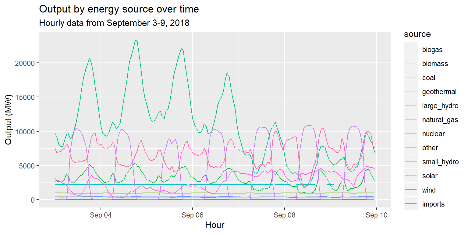
Exercise 4: Colors and fill
long_merged_energy %>%
  filter(source=="wind"|source=="solar"|source=="geothermal") %>%
  ggplot() +
  geom_line(aes(x=datetime, y=output, group=source, col=source), size=1.5) +
  labs(title="Wind vs. Solar vs. Geothermal generation", subtitle="Hourly data from September 3-9, 2018", x="Hour", y="Output (MW)")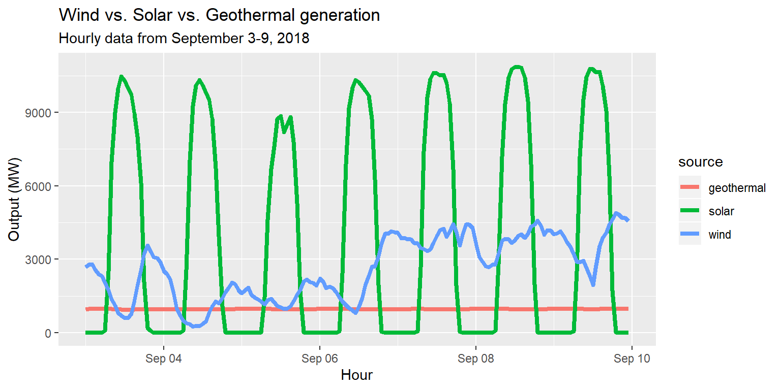
Customizing with scale_color layers
long_merged_energy %>% filter(source=="wind"|source=="solar"|source=="geothermal") %>%
  ggplot() +
  geom_line(aes(x=datetime, y=output, group=source, col=source), size=1.5) +
  scale_color_brewer(palette="Accent", name="Energy source") +
  labs(title="Wind vs. Solar vs. Geothermal generation", subtitle="Hourly data from September 3-9, 2018", x="Hour", y="Output (MW)")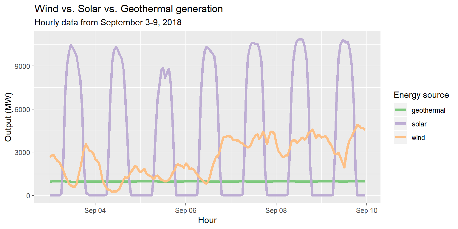
Example: Energy use by day
long_merged_energy %>%
  mutate(date=lubridate::date(datetime)) %>%
  group_by(date, source) %>%
  summarize(output=sum(output)) %>%
  ggplot() +
  geom_col(aes(x=date, y=output, group=source, fill=source)) +
  labs(title="Energy use by day", x="Day", y="Output (MW)")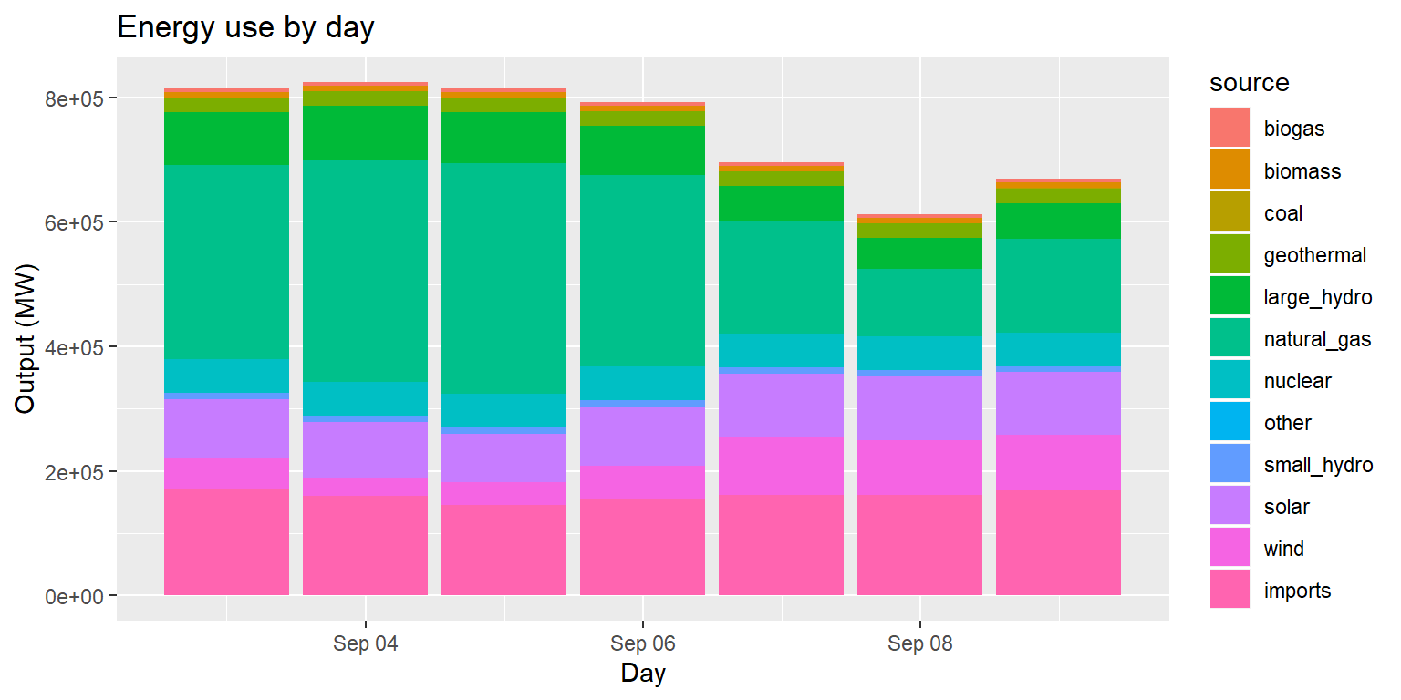
Example: Energy use by day (pos dodge)
long_merged_energy %>%
  mutate(date=lubridate::date(datetime)) %>%
  group_by(date, source) %>%
  summarize(output=sum(output)) %>%
  ggplot() +
  geom_col(aes(x=date, y=output, group=source, fill=source), position="dodge") +
  labs(title="Energy use by day", x="Day", y="Output (MW)")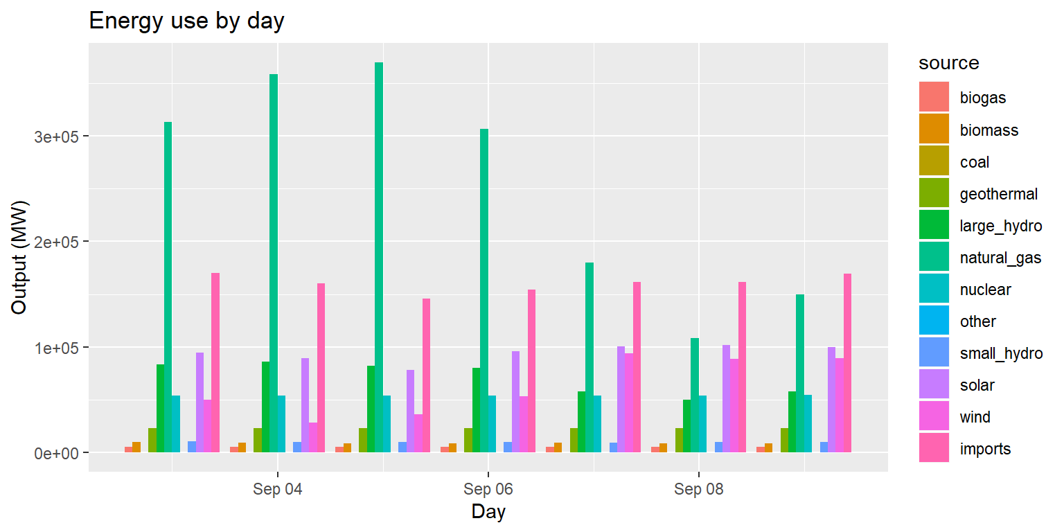
Example: Energy use by day (pos fill)
long_merged_energy %>%
  mutate(date=lubridate::date(datetime)) %>%
  group_by(date, source) %>%
  summarize(output=sum(output)) %>%
  ggplot() +
  geom_col(aes(x=date, y=output, group=source, fill=source), position="fill") +
  labs(title="Energy use by day", x="Day", y="Output (MW)")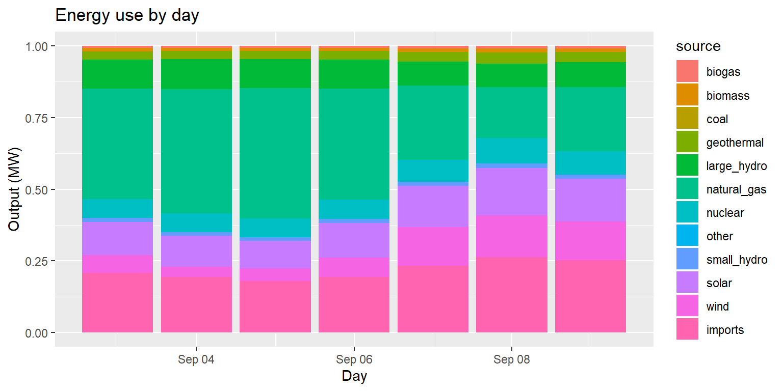
Example: Energy source group, by day
long_merged_energy_regroup %>%
  ggplot() +
  geom_line(aes(x=date, y=output, group=group, col=group), size=0.8) +
  geom_point(aes(x=date, y=output, group=group, shape=group)) +
  labs(title="Output by source group over time", subtitle="Data collected during September 3-9, 2018", x="Date", y="Output (MW)")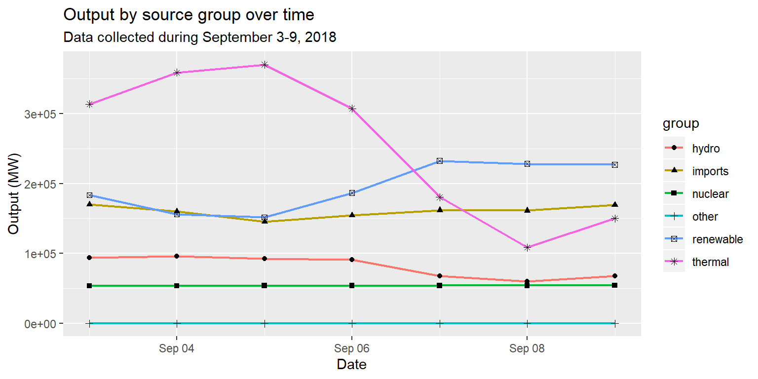
Example: Energy source group, by day
long_merged_energy_regroup %>%
  ggplot() +
  geom_line(aes(x=date, y=output, group=group, linetype=group), size=1) +
  labs(title="Output by source group over time", subtitle="Data collected during September 3-9, 2018", x="Date", y="Output (MW)")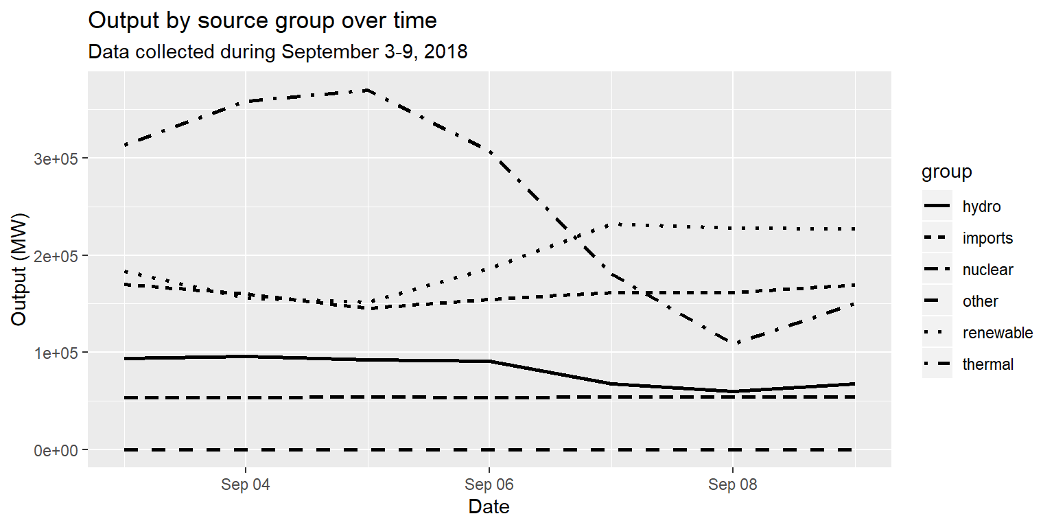
Example: Life expectancy over GDP
gapminder07 %>%
  ggplot() +
  geom_point(aes(x=log(gdpPercap), y=lifeExp, size=pop, col=continent)) +
  scale_size_continuous(name="Population") + scale_color_discrete(name="Continent") +
  labs(title="Life expectancy as a function of GDP per capita in 2007", x="Logged GDP per capita", y="Life expectancy")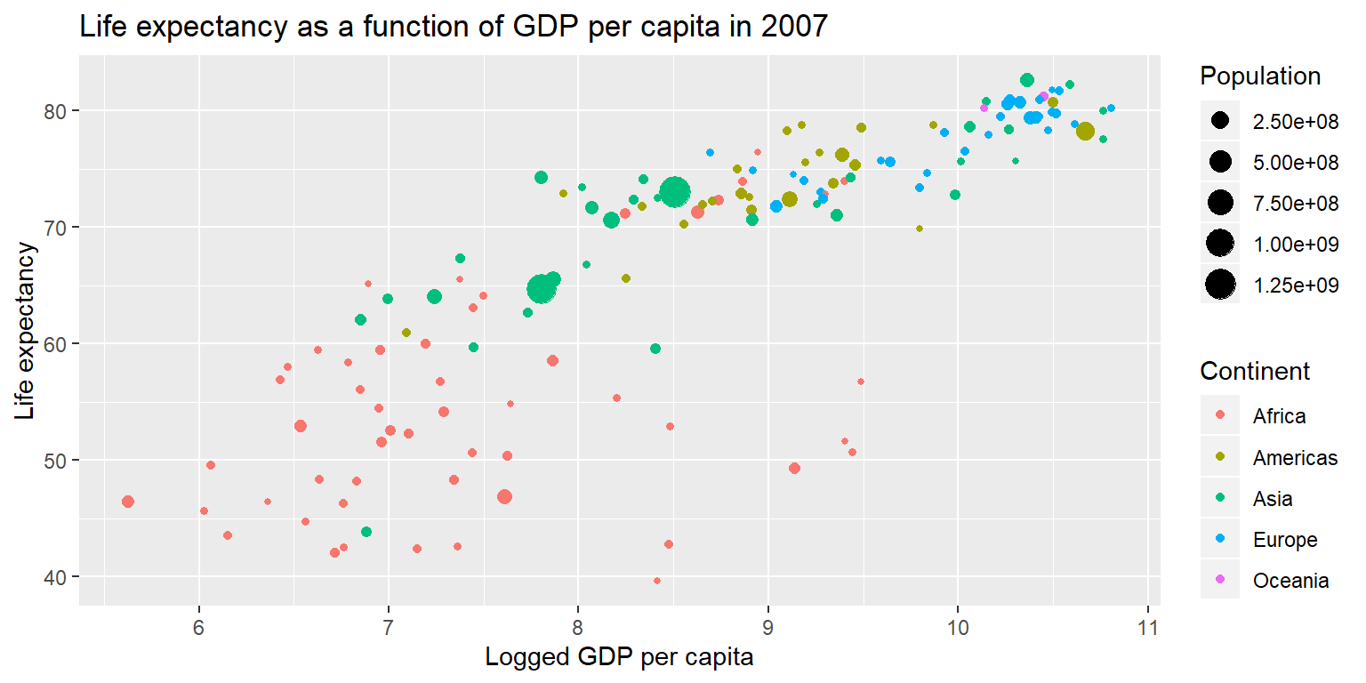
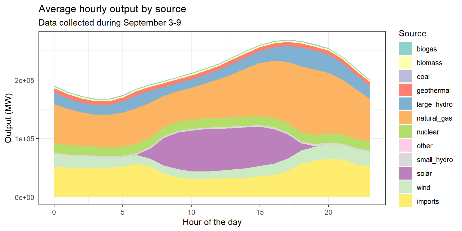
Exercise 5: Average hourly output by source
Example: Comparing generation patterns
long_gen %>%
  ggplot() +
  geom_line(aes(x=datetime, y=output, group=source, col=source), size=1) +
  labs(title="Generation over time, by energy source", subtitle="Hourly data from September 3-9, 2018", x="Hour", y="Output (MW)")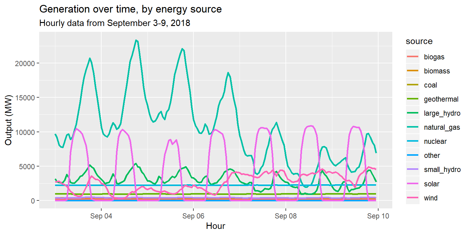
Example: Comparing generation patterns
long_gen %>%
  ggplot() +
  geom_line(aes(x = datetime, y = output)) +
  facet_wrap(~source) +
  labs(title="Generation over time, by energy source", subtitle="Hourly data from September 3-9, 2018", x="Hour", y="Output (MW)")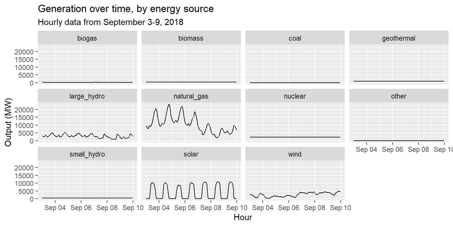
Example: Comparing generation patterns
long_gen %>%
  ggplot() +
  geom_line(aes(x = datetime, y = output)) +
  facet_wrap(~source, scales="free") +
  labs(title="Generation over time, by energy source", subtitle="Hourly data from September 3-9, 2018", x="Hour", y="Output (MW)")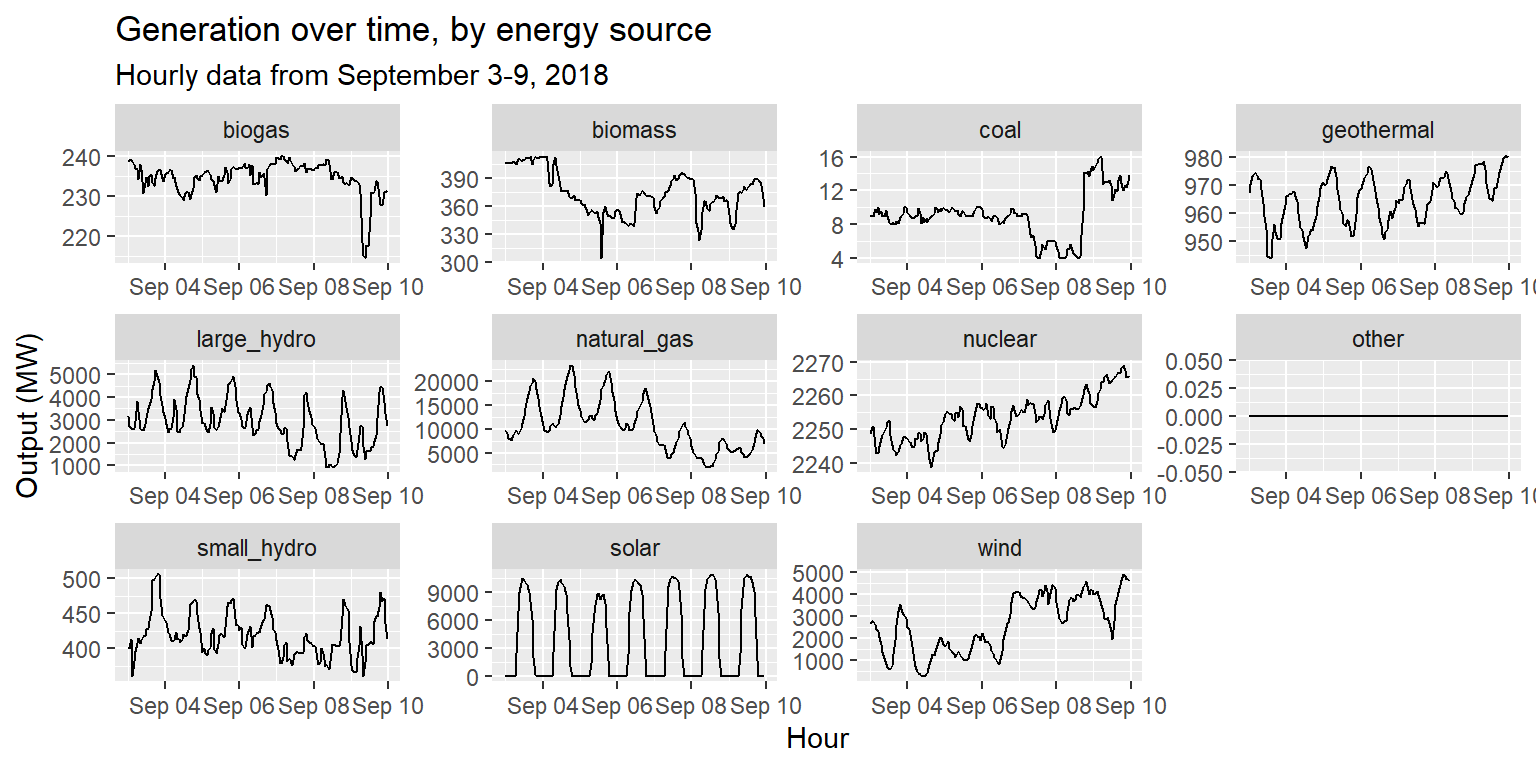
Exercise 6: Facets
long_gen_regroup %>% ggplot() +
  geom_line(aes(x=datetime, y=output, group=group, col=group), size=1) +
  scale_color_brewer(palette="Set1", name="Type of energy source") +
  facet_wrap(~type, scales="free") +
  labs(title="Generation over time, by energy source", subtitle="Hourly data from September 3-9, 2018", x="Hour", y="Output (MW)") +
  theme(legend.position = "bottom")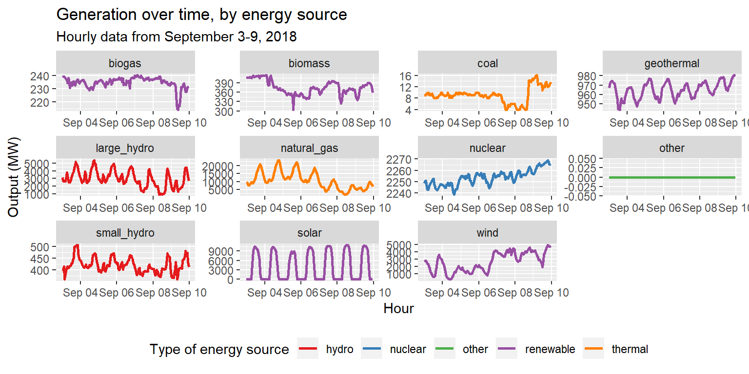
Comment your code
Always remember to comment your code!
When writing particularly complex code in
dplyrorggplot2, this includes commenting within a flow of%>%or+operators. See the lecture notes for some examples of this.